
Install & Setup
Customization
We’ve added many customization options, both as global theme settings as well as to each section of the theme. Our objective was to make it possible to create many distinct types of content just by changing a few options (one of the big examples of this is the Multicolumn section), allowing our theme users to change its appearance to better match their style preferences.
This includes not only color settings, but font sizes (headings), global typography options like the use of uppercase text, etc., as well as many options related to theme specific features, like the ability to change between two different file list image styles.
Below, we show examples of how the appearance of different elements can be completely changed just by switching a few theme options:
Components
Sections
Components
Product Cards
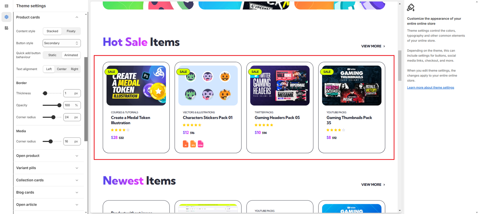
By changing a few settings, we can modify their appearance and make them look like this:
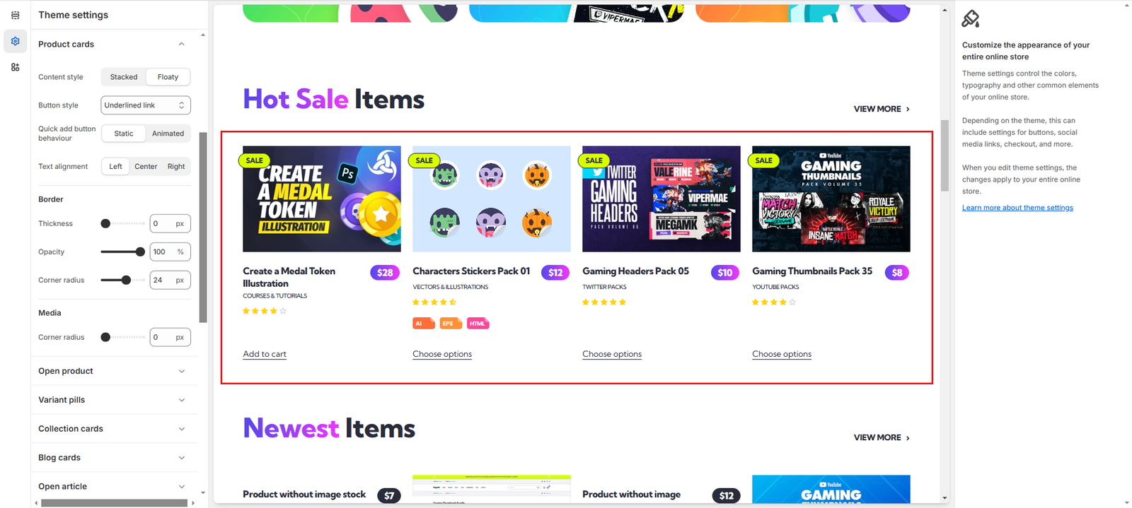
We list the settings changed below ordered by section, in case you want to replicate this style:
Products (Theme settings)
- Title position: changed to Title first
- Price style: changed to Boxed
- File list style: changed to Tag
Product Cards (Theme settings)
- Content style: changed to Floaty
- Button style: changed to Underlined link
- Quick add button behaviour: changed to Static
- Border – Thickness: changed to 0
- Media – Corner radius: changed to 0
Collection Cards
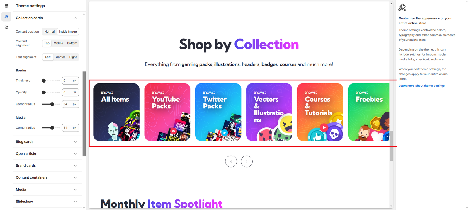
By changing a few settings, we can modify their appearance and make them look like this:
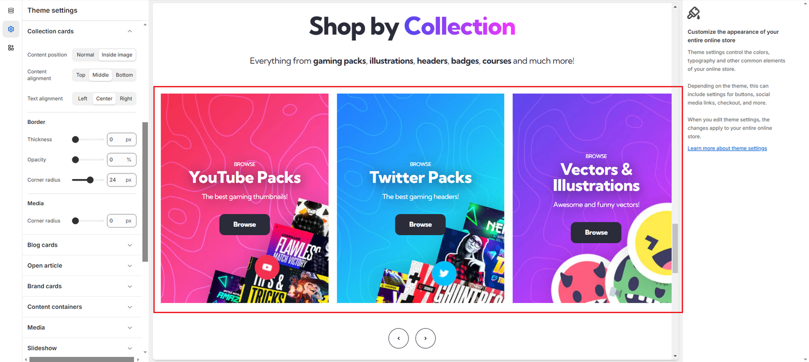
We list the settings changed below ordered by section, in case you want to replicate this style:
Collection list (Section settings)
- Collection – Heading size: changed to H2
- Collection – Show collection description: changed to Enabled
- Collection – Button label: changed to Browse
- Collection – Number of columns on desktop: changed to 3
- Collection – Column width: changed to 460
Collection Cards (Theme settings)
- Content alignment: changed to Middle
- Text alignment: changed to Center
- Media – Corner radius: changed to 0
Blog Cards
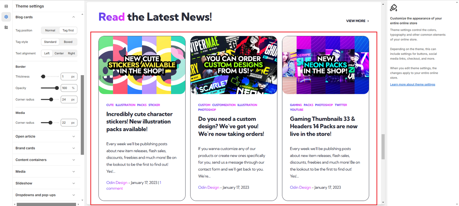
By changing a few settings, we can modify their appearance and make them look like this:
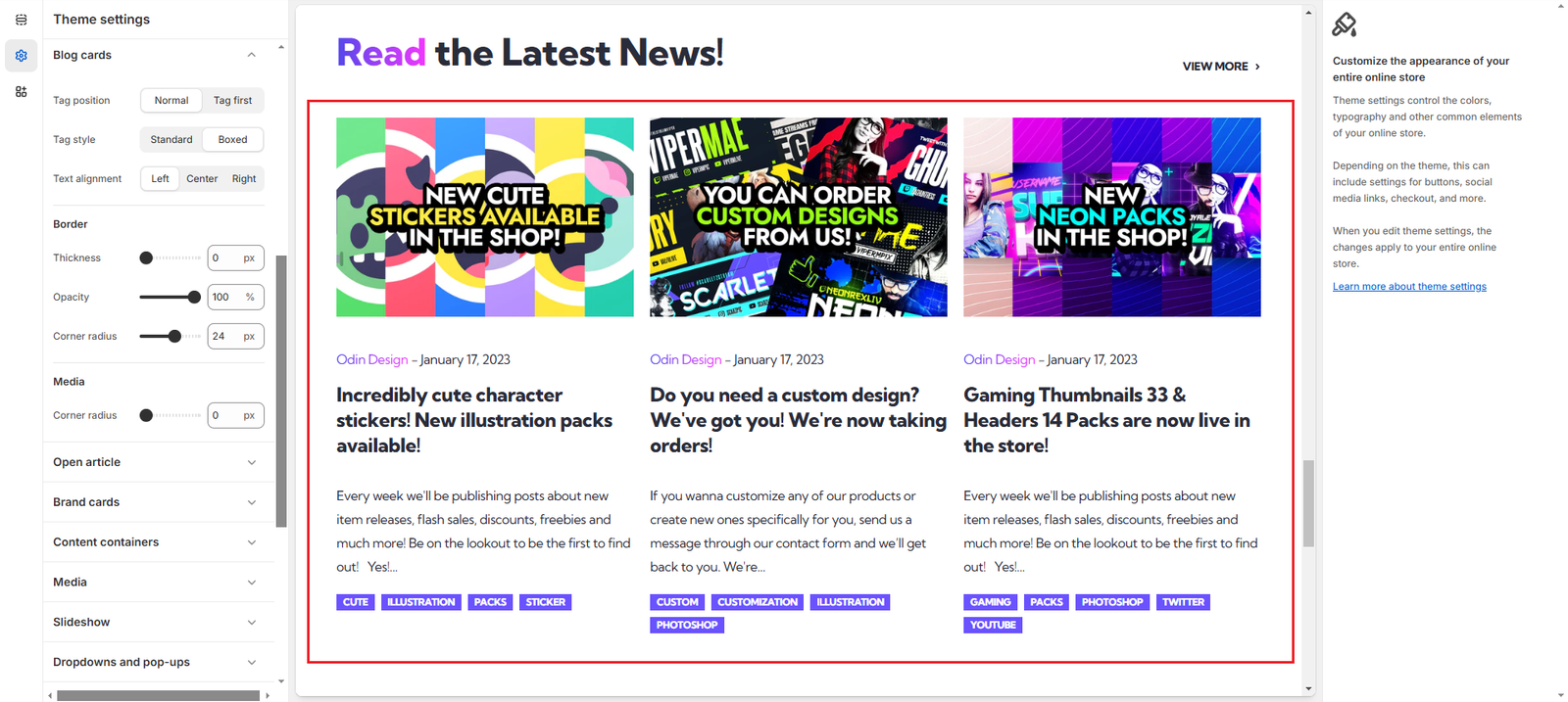
We list the settings changed below ordered by section, in case you want to replicate this style:
Featured Blog (Section settings)
- Show comment count: changed to Disabled
Blog Cards (Theme settings)
- Tag position: changed to Normal
- Tag style: changed to Boxed
- Border – Thickness: changed to 0
- Media – Corner radius: changed to 0
Sections
Header
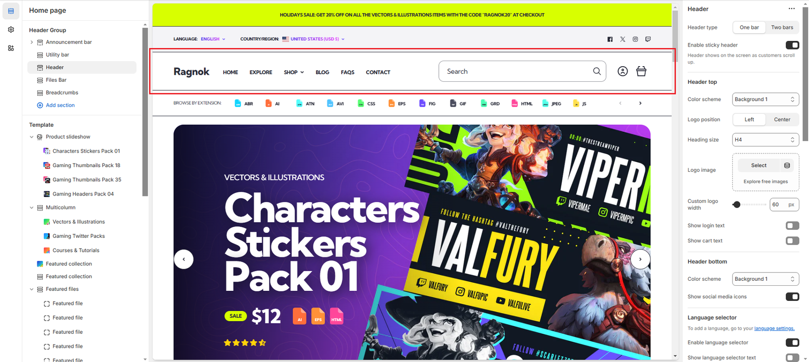
By changing a few settings, we can modify its appearance and make it look like this:
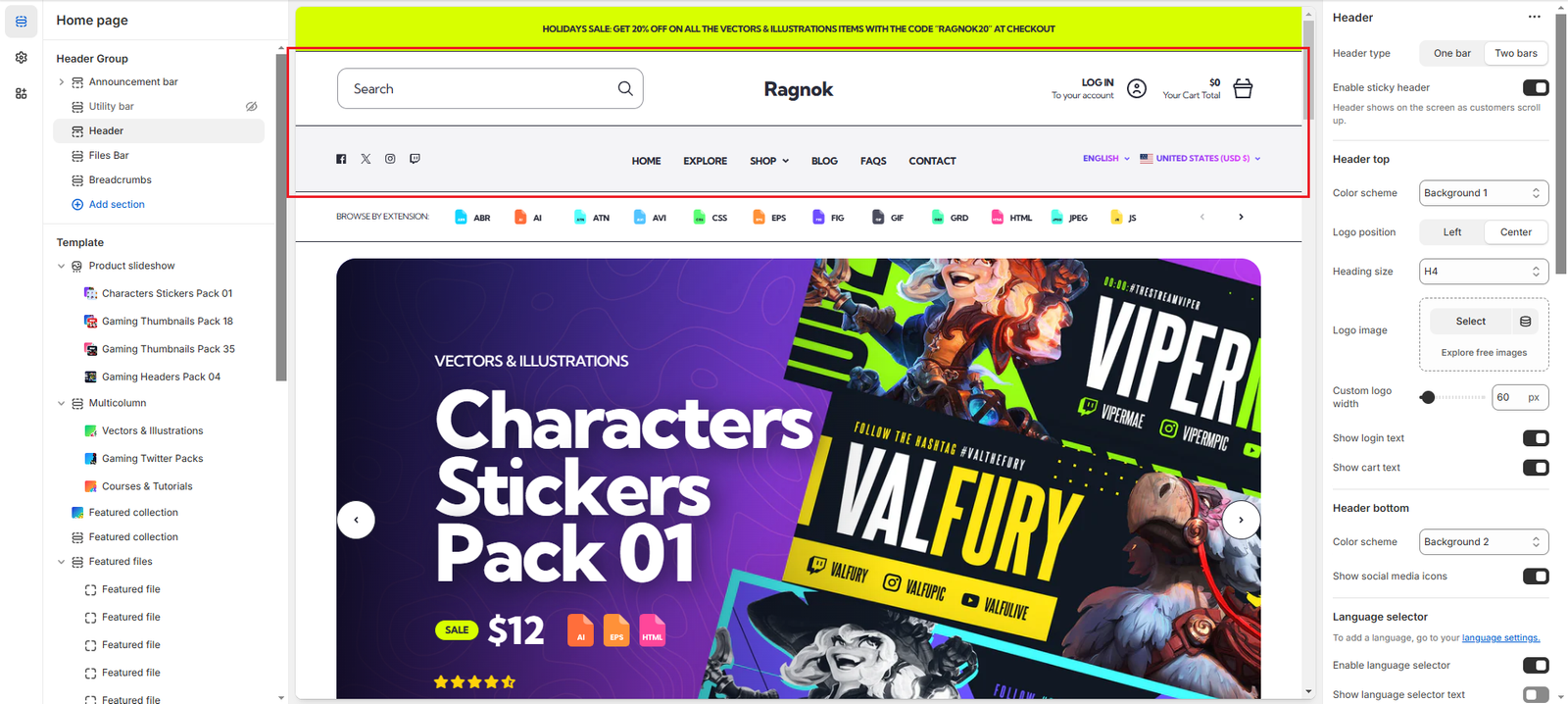
We list the settings changed below ordered by section, in case you want to replicate this style:
Utility bar
- Hide the section using the eye button at the right side of its name
Header (Section settings)
- Header type: changed to Two bars
- Header top – Logo position: changed to Center
- Header top – Show login text: changed to Enabled
- Header top – Show cart text: changed to Enabled
- Header bottom – Color scheme: changed to Background 2
Multicolumn
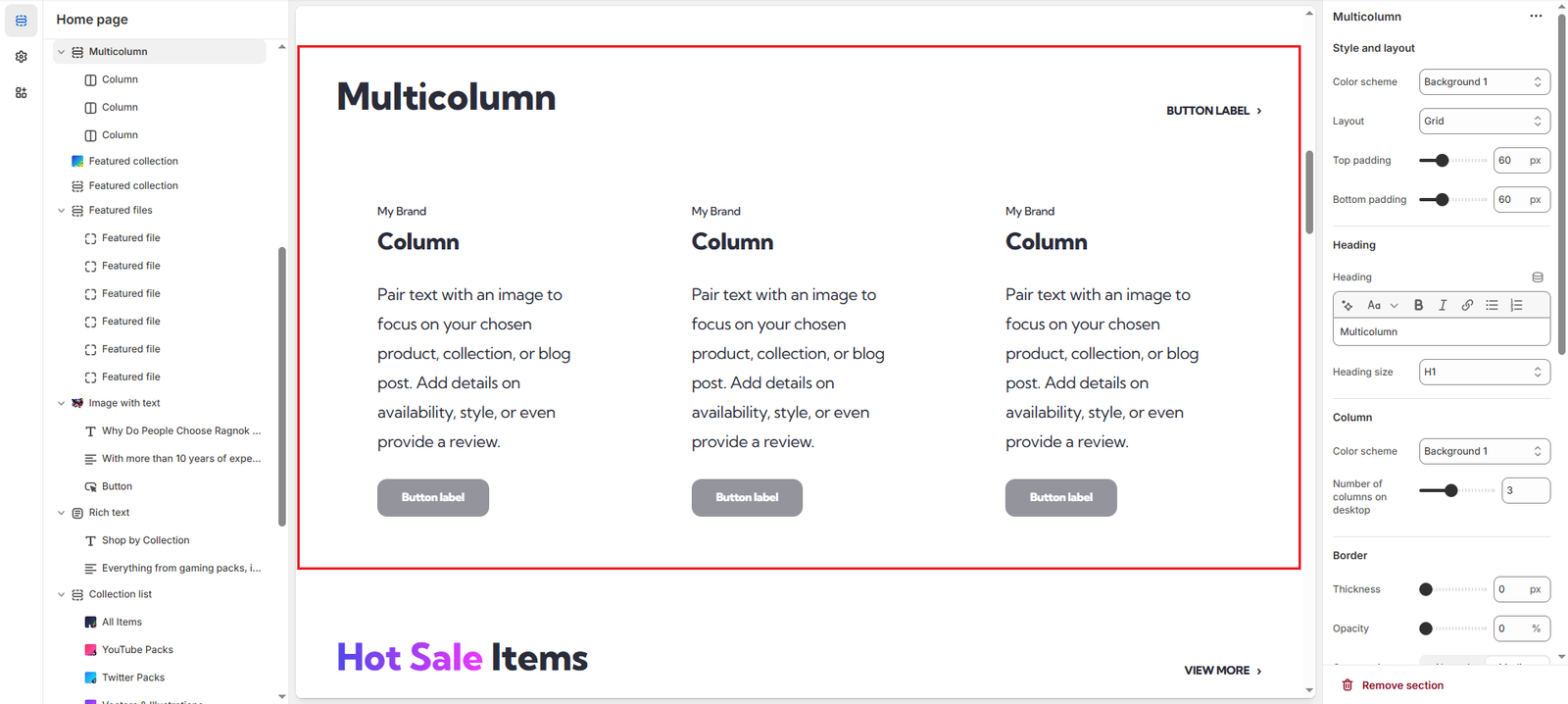
By changing a few settings, we can modify its appearance and make it look like this:
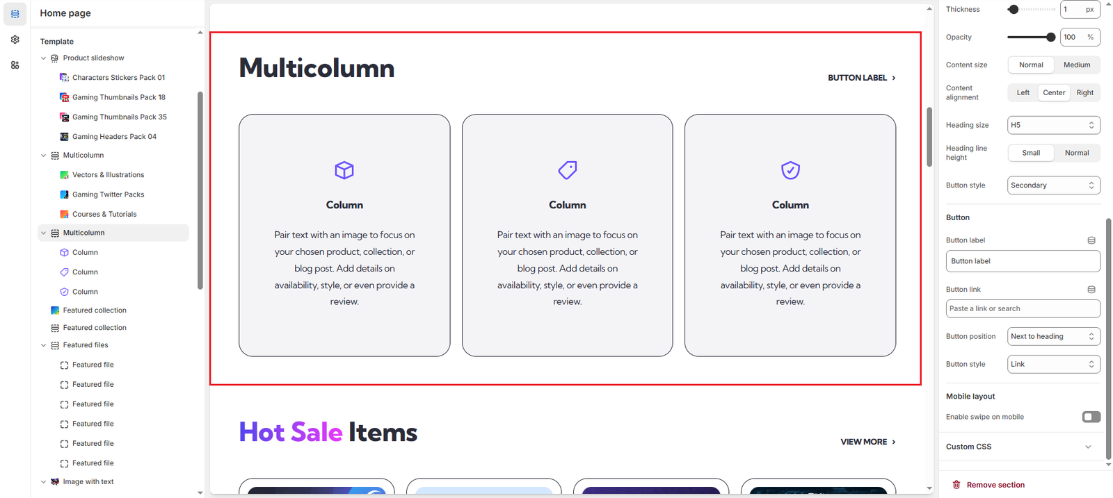
We list the settings changed below ordered by section, in case you want to replicate this style:
Multicolumn (Section settings)
- Column – Color Scheme: changed to Background 2
- Border – Thickness: changed to 1px
- Border – Opacity: changed to 100%
- Content size: changed to Normal
- Content alignment: changed to Center
- Heading size: changed to H5
- Heading line height: changed to Small
Multicolumn (Block settings)
- Image: changed to Select an image
- Pre heading: removed
- Button label: removed
Newsletter
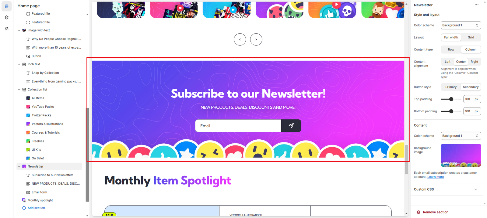
By changing a few settings, we can modify its appearance and make it look like this:
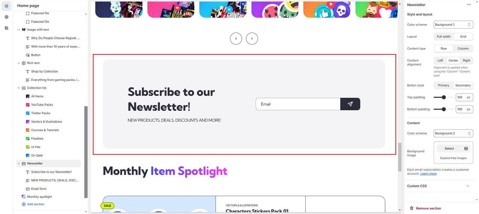
We list the settings changed below ordered by section, in case you want to replicate this style:
Newsletter (Section settings)
- Layout: changed to Grid
- Content type: changed to Row
- Content – Color scheme: changed to Background 2
- Content – Background image: removed
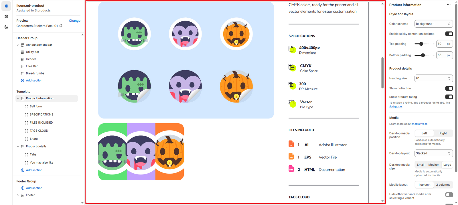
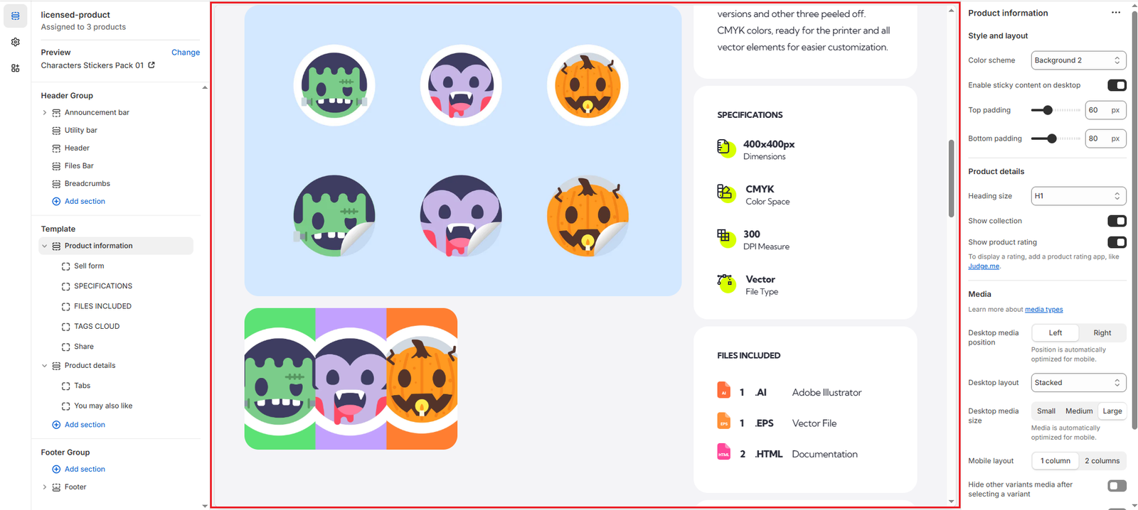
Product information
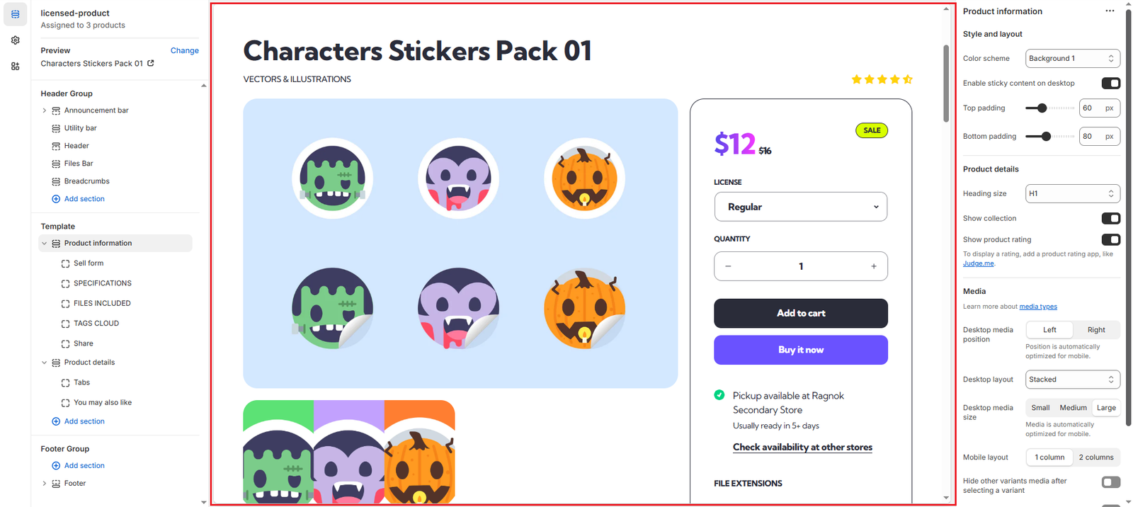
By changing a few settings, we can modify its appearance and make it look like this:
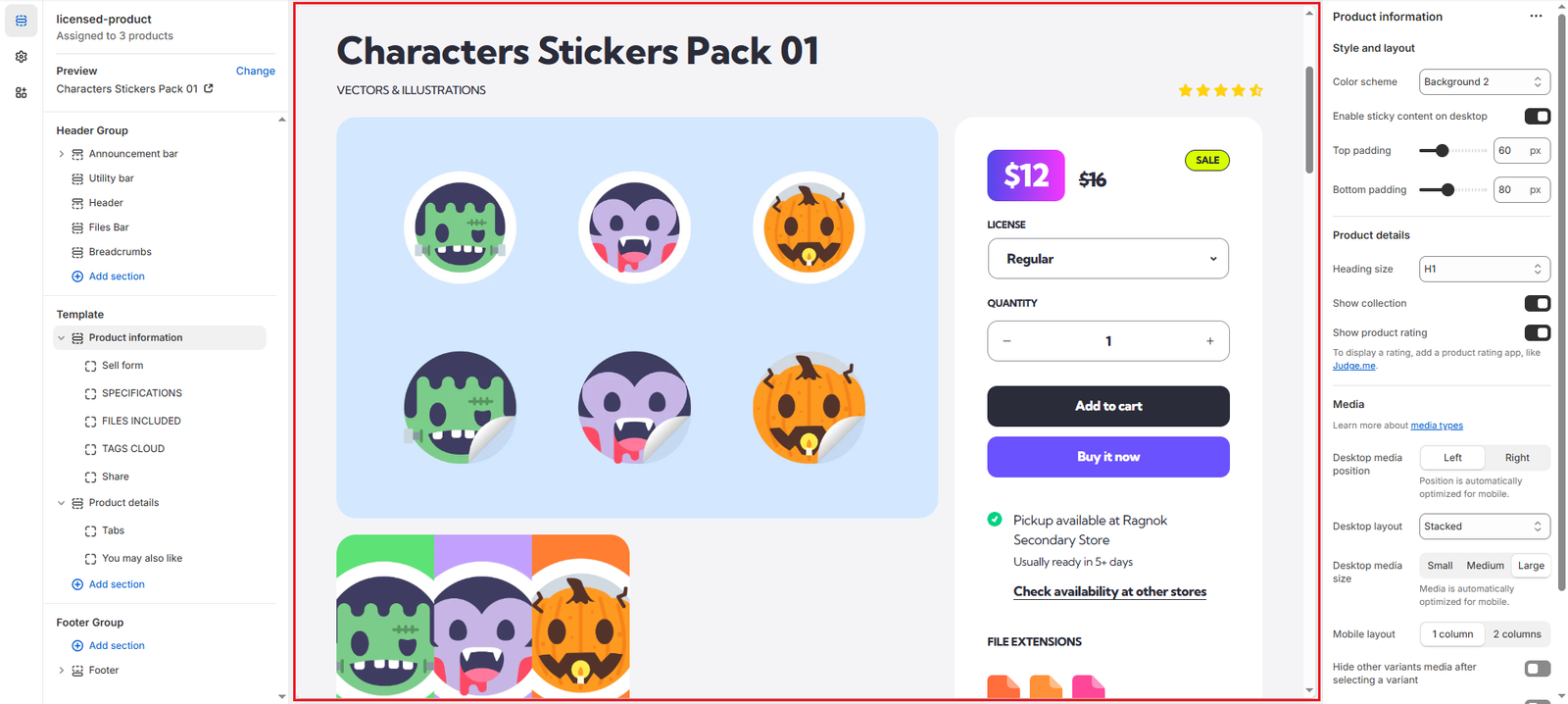
We list the settings changed below ordered by section, in case you want to replicate this style:
Product information (Section settings)
- Color scheme: changed to Background 2
Products (Theme settings)
- Price style: changed to Boxed
Open Product (Theme settings)
- Product details – Style: changed to Boxed
- Border – Thickness: changed to 0